


Our logo
The Agropur logo has undergone many changes over the years, from the three-leaf clover design of the 1940's to the four stylized milk drops you see today. This short history will give you an overview of the permutations our logo has undergone since our Cooperative was founded in 1938.
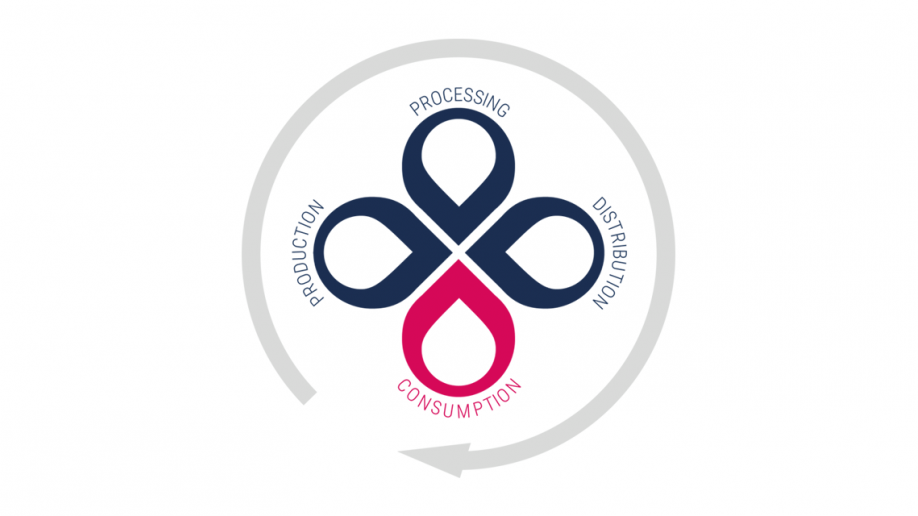
The four milk drops in our logo: A symbol of who we are today
The four drops of milk in Agropur’s logo symbolize the four stages in the life cycle of an Agropur dairy product: production, processing, distribution and consumption. The reason that one of the drops, representing consumption, is a different colour is to emphasize how important our consumers are to us.
Agropur’s visual identity as we know it now dates back to 1979, but fully reflects the way we operate today. The linear producer/processor-distributor-retailer-consumer relationship no longer exists. It has been replaced by an integrated, circular relationship in which each party is connected directly to every other — just like the four drops in our logo.
We are also convinced that if we want to change things and build a world that is fairer, more equitable and more respectful of the environment, we must all work together. Our customers and consumers are demanding, and so are we.
When you choose an Agropur product, you are helping to build a better world.
How our logo has changed over time
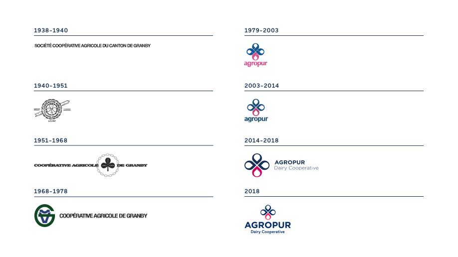
Over the years, our logo has undergone many changes. When the Cooperative was founded in 1938, it was simply our legal name at the time: Société coopérative agricole du canton de Granby.
In 1940, we adopted a new logo, comprising a three-leaf clover (the leaves standing for quality, economy and service) and a diagonal arrow representing the link from farm to table. In 1951, this clover design was modernized and combined with the organization’s new, shorter name: Coopérative agricole de Granby.
In 1968, we introduced an entirely new logo, discarding the clover design and instead using the initials of our name: the letter C lying on its side, an upside-down A (forming a stylized cow’s head) and a large green G (for Granby, the town where the Cooperative was founded). We used this logo for the next 11 years.
In 1979, Agropur adopted the logo design that has since become so familiar to consumers: four drops of milk, symbolizing production, processing, distribution and consumption.
In 2004, we modernized this logo but retained the same basic elements and design, because they still expressed our mission and our values. We refined and simplified the four-drop symbol, and changed the font colour of the word “agropur” to match the dark blue of three of the four drops. In 2014, we updated the typography in our logo: we changed our name to all capital letters (AGROPUR), moved it to the right of the symbol, and added the words “Dairy Cooperative” underneath. These changes were designed to reflect our Cooperative’s outward-looking character and the fact that, as our founders had desired, it “knows no borders.”
The typography in our logo has continued to evolve. In 2017, we modernized it again. It is now used as a master brand on all our products.

Web visual identity guide
This guide outlines the graphic standards that must be respected when using the Agropur visual identity. It was produced by the Human Capital and Communications Department
Official logo
Download the Agropur's official logo.